Modernize Pattern Skin
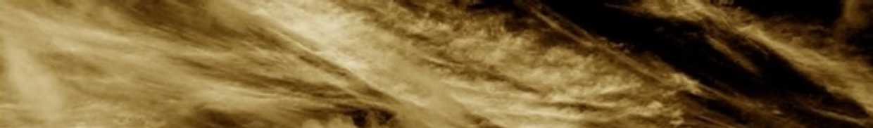
The PatternSkin has a professional look. Skins follow a fashion cycle. We could tweak the skin a bit to make it look very modern. A low hanging fruit is to do something with the currently empty banner. How about adding a subtle background image? Inspired by the MediaWiki look, I created this background banner that gives a modern look and also conveys the TWikiLogos branding message. This propsal is tracked in Bugs:Item748|
|
 -- PeterThoeny - 22 Oct 2005
I think by modern
-- PeterThoeny - 22 Oct 2005
I think by modern- I like it, in that it is in the background, non intrusive. -- AntonAylward
- Can you do a Cookbook entry for that please? -- AntonAylward
- The cookbook entry is at: http://develop.twiki.org:80/~develop/cgi-bin/view/TWiki/PatternSkinCssCookbookNoTopBar
 -- ArthurClemens - 24 Oct 2005
- The cookbook entry is at: http://develop.twiki.org:80/~develop/cgi-bin/view/TWiki/PatternSkinCssCookbookNoTopBar

#patternTopBar {
  background:#FAF7E8;
  height:80px;
  background-image:url(SepiaFieldBar.jpg);
  background-repeat:no-repeat;
  background-position:top left;
  border-bottom:5px solid #E2DCC8;
}

.patternTopBarLogo img {
  display:none;
}
.patternTopBarLogo {
  margin-top:25px;
  display:block;
}
.patternTopBarLogo:before {
  content:"TWiki";
  font-family:"Lucida Grande", verdana, arial, sans-serif;
  font-size:45px;
  color:white;
  font-weight:bold;
  text-shadow:1px 1px 1px black;
}
-- MichaelDaum - 23 Nov 2005
Yes, of course you can put an image up there. But what does it reveal? Try to find something that is about TWiki.
And the logo should be fitted in as well.
-- ArthurClemens - 23 Nov 2005
What are you talking about: the default appearance shipped with TWiki/Dakar
or the TWiki.org appearance?
In the first case we need something that's simply nice without carrying any further burden.
In the second case we need something that imparts the twiki message.
Please, please, please make this two separate issues.
Just for a moment, forget about symbolism, as this topic is about modernizing PatternSkin.
-- MichaelDaum - 23 Nov 2005
If this topic is about providing functionality, here's the documentation topic: http://develop.twiki.org/~develop/cgi-bin/view/TWiki/PatternSkinCssCookbookTopBarBackgroundImage
- header-3.gif - light solid background, gray:

- header-4.gif - very light solid background, gray: screenshot

- header-4-1.gif - light striped background, 1 pixel, gray: screenshot

- header-4-1c.gif - light striped background, 1 pixel, cyan: screenshot

- header-4-2.gif - light striped background, 2 pixel, gray: screenshot

%<nop/>INCLUDE{"Main.WebTopBar" warn="<span class='patternTopBarLogo'><a href='%WEBLOGOURL%'><img src='%WEBLOGOIMG%' border='0' alt='%WEBLOGOALT%'/></a></span><!-- /patternTopBarLogo-->"}%
instead of
<span class="patternTopBarLogo"><a href="%WEBLOGOURL%"><img src="%WEBLOGOIMG%" border="0" alt="%WEBLOGOALT%"/></a></span><!-- /patternTopBarLogo-->This way admins that customize their top bars won't lose it, and those who doen't will have a pretty default top bar. -- AntonioTerceiro - 19 Dec 2005 For performance I would like to avoid another INCLUDE on every page. -- PeterThoeny - 19 Dec 2005 The striped images are so light it is hard to tell what's on them. If the image contents should be hidden it is clearly not a good image. I also don't find the straight borders an improvement, as they deprive the headers of any playfulness they had. -- ArthurClemens - 20 Dec 2005 The idea of the straight lines was to show paper on a table, but I see your point. OK, new version based on your feedback:
- header-5-1.gif - lightly darkened striped background, 1 pixel, rounded borders: screenshot

 See also png, jpg 4x, jpg 10x, and original unstriped png version. If needed, also the 1px mask.
-- PeterThoeny - 05 Jan 2006
I have made a combination of the webbgcolor and the image. To stand next to the webbgcolor, the image must not be too light. So I made a gradient for the lines, light at the left and transparent to the right.
Try out, not tested on other browsers: http://visiblearea.com/devtwiki/bin/view/Sandbox/
See also png, jpg 4x, jpg 10x, and original unstriped png version. If needed, also the 1px mask.
-- PeterThoeny - 05 Jan 2006
I have made a combination of the webbgcolor and the image. To stand next to the webbgcolor, the image must not be too light. So I made a gradient for the lines, light at the left and transparent to the right.
Try out, not tested on other browsers: http://visiblearea.com/devtwiki/bin/view/Sandbox/ Feedback:
 - I find the image color on the right a bit too dark, it draws the eyes away from the actual content
- I find the web color on the right too distractive, and somehow does not fit into the design.
- most of us at today's meeting liked the title bar in the WebLeftBar of the Cairo version
 Without bgcolor, with web indicator and a bit lighter image:
 -- ArthurClemens - 08 Jan 2006
I like the "Without bgcolor, with web indicator and a bit lighter image" very much!!
-- PeterThoeny - 08 Jan 2006
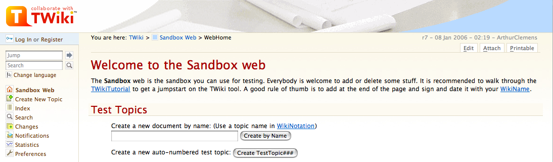
Small suggestion to make it very clear: In the title bar, call it "Sandbox web" or "Sandbox Web" instead of just "Sandbox".
-- PeterThoeny - 08 Jan 2006
Just a suggestion. DON'T.
-- AntonAylward - 08 Jan 2006
-- ArthurClemens - 08 Jan 2006
I like the "Without bgcolor, with web indicator and a bit lighter image" very much!!
-- PeterThoeny - 08 Jan 2006
Small suggestion to make it very clear: In the title bar, call it "Sandbox web" or "Sandbox Web" instead of just "Sandbox".
-- PeterThoeny - 08 Jan 2006
Just a suggestion. DON'T.
-- AntonAylward - 08 Jan 2006


| I | Attachment | History | Action | Size | Date | Who | Comment |
|---|---|---|---|---|---|---|---|
| |
SepiaFieldBar.jpg | r1 | manage | 17.2 K | 2005-11-23 - 09:51 | UnknownUser | |
| |
SepiaFieldHeader.jpg | r1 | manage | 117.3 K | 2005-11-23 - 09:44 | UnknownUser | |
| |
TWiki_header_white_and_web_.png | r1 | manage | 84.6 K | 2006-01-08 - 02:53 | UnknownUser | |
| |
TWiki_header_with_webbgcolor.png | r1 | manage | 85.2 K | 2006-01-08 - 02:53 | UnknownUser | |
| |
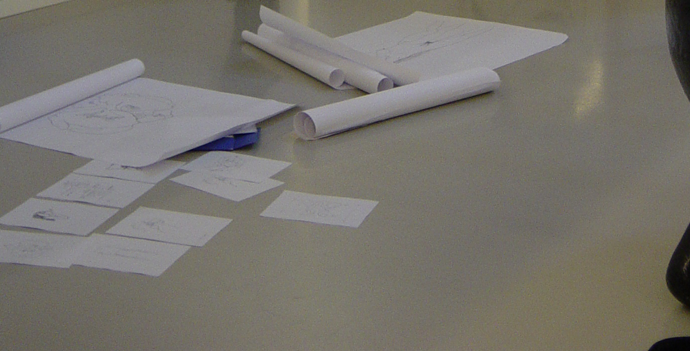
filemerge.png | r1 | manage | 54.1 K | 2005-11-24 - 15:02 | UnknownUser | header - the inspiration |
| |
header-3.gif | r1 | manage | 25.2 K | 2005-12-19 - 05:30 | PeterThoeny | light solid background |
| |
header-4-1.gif | r1 | manage | 21.5 K | 2005-12-19 - 05:31 | PeterThoeny | light striped background, 1 pixel |
| |
header-4-1c.gif | r1 | manage | 17.8 K | 2005-12-19 - 05:31 | PeterThoeny | light striped background, 1 pixel, cyan |
| |
header-4-2.gif | r1 | manage | 23.3 K | 2005-12-19 - 05:31 | PeterThoeny | light striped background, 2 pixel |
| |
header-4.gif | r1 | manage | 17.5 K | 2005-12-19 - 05:28 | PeterThoeny | very light solid background |
| |
header-5-1.gif | r1 | manage | 15.5 K | 2005-12-20 - 00:44 | PeterThoeny | lightly darkened striped background, 1 pixel, round edge |
| |
header-6-4.png | r2 r1 | manage | 44.7 K | 2006-01-05 - 01:26 | PeterThoeny | original with smoother color palette, without striped background |
| |
header-6-4b.gif | r1 | manage | 27.1 K | 2006-01-05 - 01:14 | PeterThoeny | 1px striped background with smoother color palette, gif with optimized octree reduction with error diffusion |
| |
header-6-4b.jpg | r1 | manage | 10.9 K | 2006-01-05 - 01:12 | PeterThoeny | 1px striped background with smoother color palette, jpg 4x compression |
| |
header-6-4b.png | r1 | manage | 39.4 K | 2006-01-05 - 01:11 | PeterThoeny | 1px striped background with smoother color palette |
| |
header-6-4b10.jpg | r1 | manage | 7.2 K | 2006-01-05 - 01:12 | PeterThoeny | 1px striped background with smoother color palette, jpg 10x compression |
| |
header-orig.png | r1 | manage | 1249.1 K | 2005-11-24 - 15:02 | UnknownUser | header original photograph |
| |
header-stripe1.png | r1 | manage | 0.5 K | 2006-01-05 - 01:09 | PeterThoeny | 1px stripe image mask. offset 2px from left |
| |
header.png | r1 | manage | 75.9 K | 2005-11-24 - 14:59 | UnknownUser | header image |
| |
header_illustration.png | r1 | manage | 127.1 K | 2005-11-23 - 22:23 | UnknownUser | |
| |
screen-4-1.png | r1 | manage | 85.6 K | 2005-12-19 - 05:17 | PeterThoeny | screenshot, light striped background, 1 pixel |
| |
screen-4-1c.png | r1 | manage | 73.5 K | 2005-12-19 - 05:17 | PeterThoeny | screenshot, light striped background, 2 pixel, cyan |
| |
screen-4-2.png | r1 | manage | 85.0 K | 2005-12-19 - 05:17 | PeterThoeny | screenshot, light striped background, 2 pixel |
| |
screen-4.png | r1 | manage | 73.7 K | 2005-12-19 - 05:36 | PeterThoeny | screenshot, very light background |
| |
screen-5-1.png | r1 | manage | 86.4 K | 2005-12-20 - 00:45 | PeterThoeny | screenshot of lightly darkened striped background, 1 pixel, round edge |
Topic revision: r30 - 2006-03-04 - ArthurClemens


Copyright © 1999-2026 by the contributing authors. All material on this collaboration platform is the property of the contributing authors.