A New Navigation Model For TWiki.Org
Summary of past discussions...
- Use tabs or buttons on the top for our main topics of interest - see WebPageAudienceSiteStructure
- Don't use Webs for tabs
- Don't use side bar for navigation - have just site tools like WebChanges in it
- Consider using color codes for different sections
- Use trigger words for links like "contribute" or "get involved"
- Use images instead of just plain text - maybe show some faces as well
- Renaming "web" to "section" is a difficult. We already have two different use cases for "section" in wikis: (1) sectional editing and (2) start-end section in transclusions. "Web space" or "work space" meets the typical use of webs more closely.
Navigation examples
- http://plone.org/

- http://digg.com/
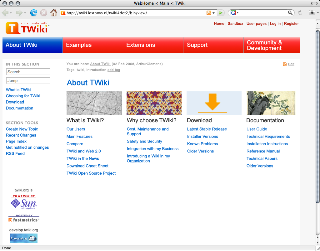
- TWikiOrgHomepageRedesign2007
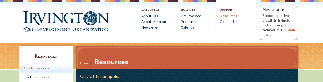
- http://www.irvingtondevelopment.org
- WebTopBarTest
First Round of Design Proposals
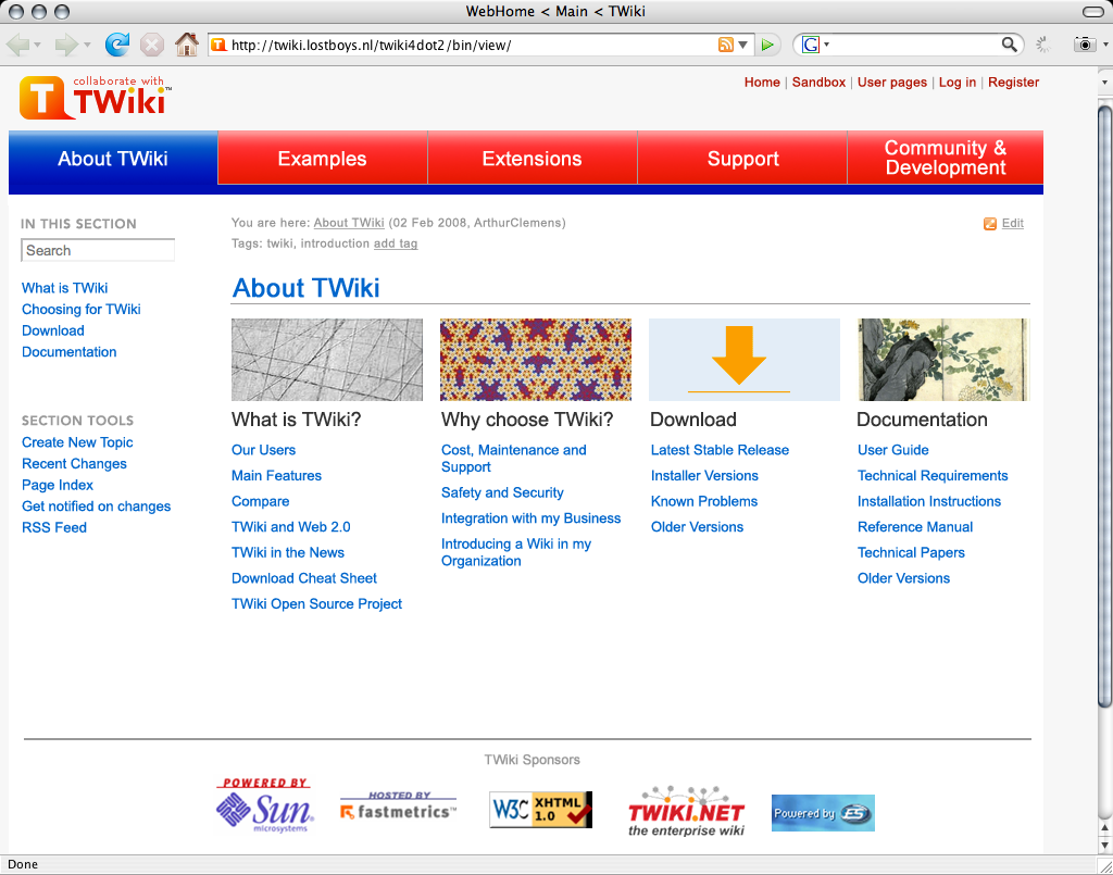
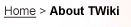
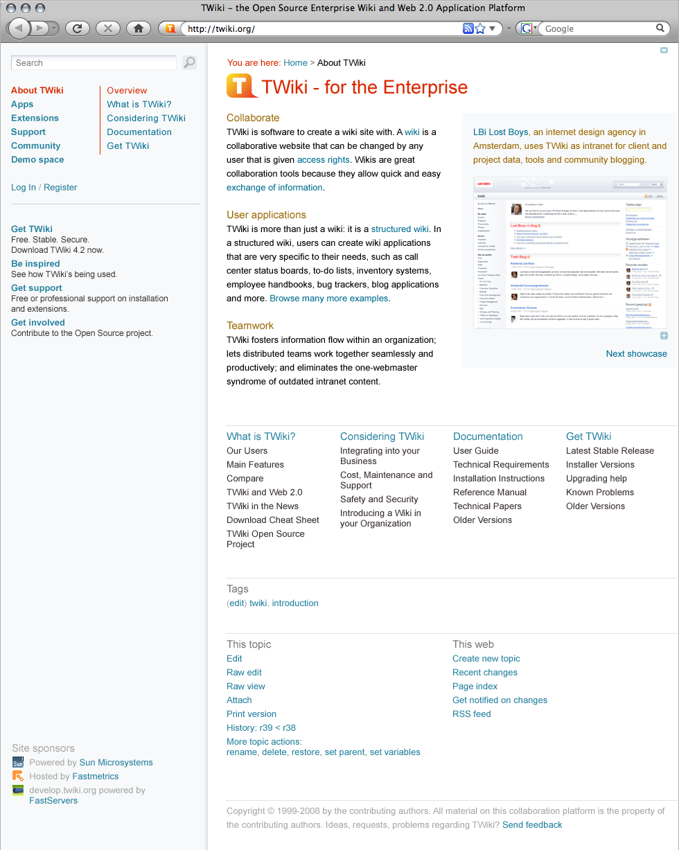
About
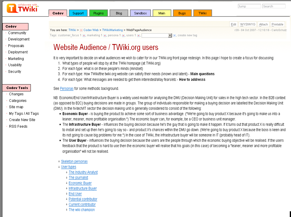
There's a general agreement, that Arthurs design proposals lead into the rigth direction. Still some concerns about the right colors, how to style the top bar, use tabs or not...Design decisions
- There are 5 main sections. The menu blocks are images so we can use the Avenir font.
- Main web is not one of the main sections; it is offered as secondary link at the top: "User pages"
- Also Sandbox is a secondary link
- The left bar shows a number of links of the current section. It would be good to have some kind of hierarchical navigation if you are one level deeper in the site. But without having a costly dynamic search. Possibly a fixed menu for a number of main sections could work.
- There is a white content area. The page has a fixed width. That gives visual 'rest', less complexity. Occasionally an image or large table will stick out (not such a problem on developer pages), but we should try to stick to the content width.
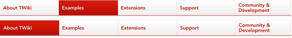
Tabs or no tabs?
Actually we have no tabs at all in these drafts, they are just large buttons. If we wanna have tabs we need to visually connect the body with the tab. This works best using one of the following apporaches:- put a second bar underneath the tab bar which has the same color as the active tab
- like amazon does it
- like amazon
- use the same color for both, highlighted tab and background
- as wikipedia does it (same as in my color coding examples)
- as wikipedia
First Draft
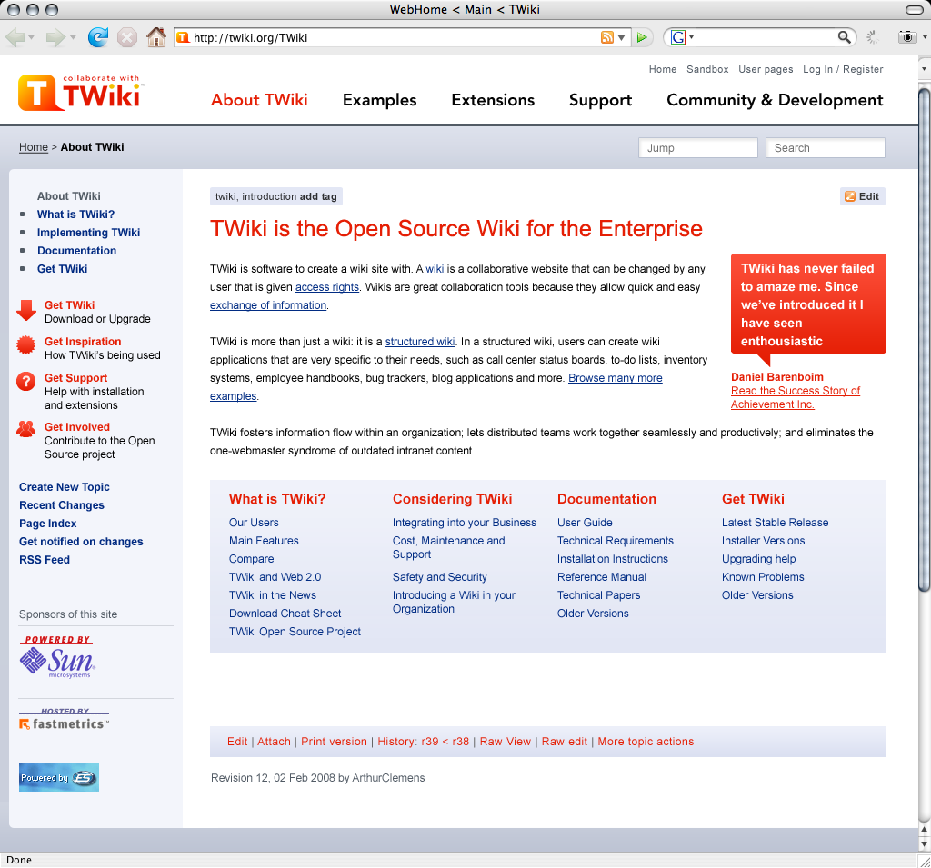
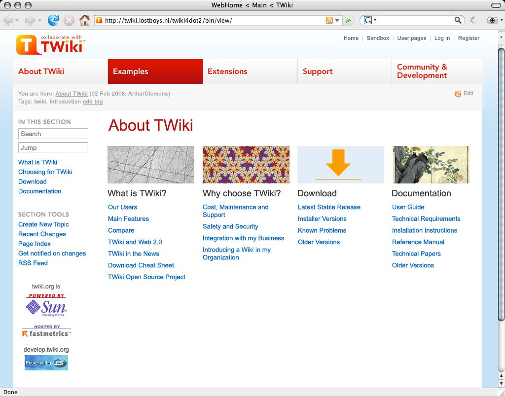
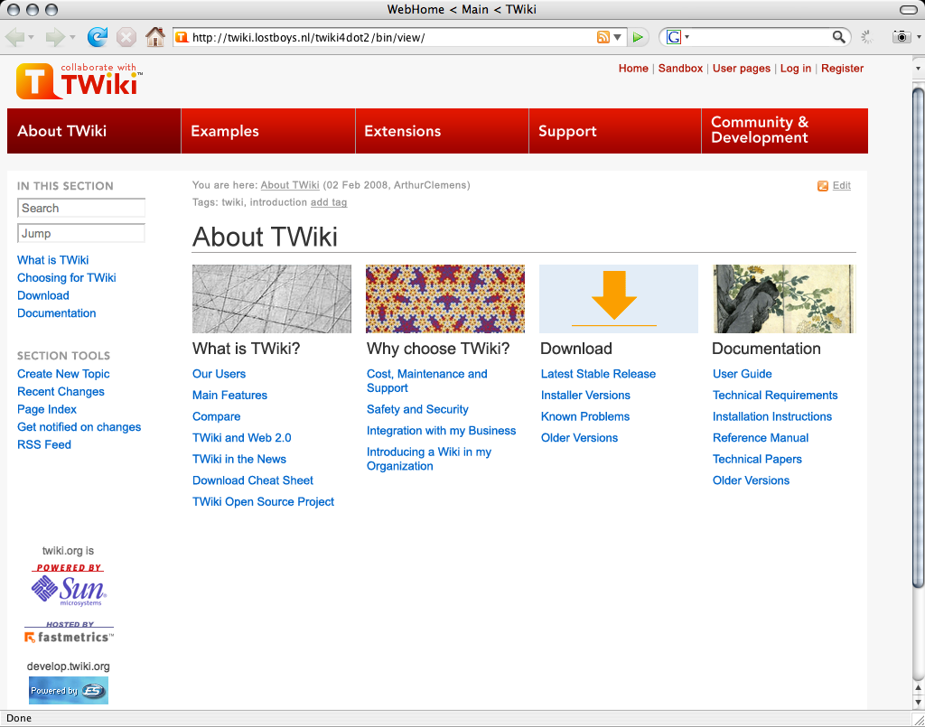
This is a design proposal for a modified pattern skin, demonstrating an overview page as defined in WebPageAudienceSiteStructure. first draft -- ArthurClemens - 03 Feb 2008 Reactions:- Too red, too angry
Second Draft
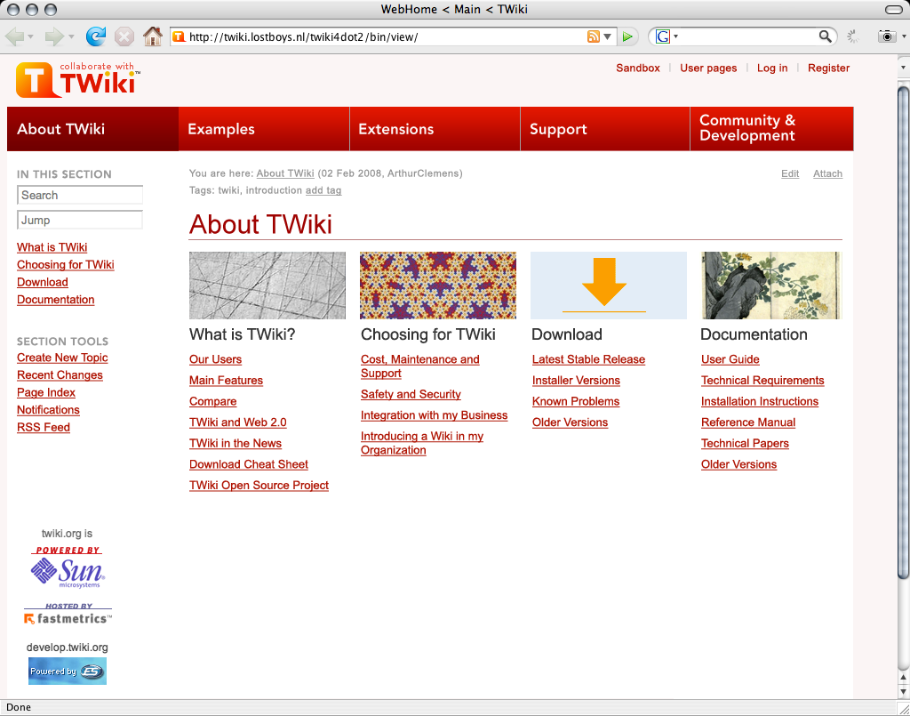
Less red, and less link underlines: Second draft -- ArthurClemens - 03 Feb 2008 Reactions:- lost a bit of "edge" by removing the red menu bar and leaving the text in red.
- "Choosing for TWiki" is not good English. "Why TWiki?" or "Why choose TWiki?".
Third Draft
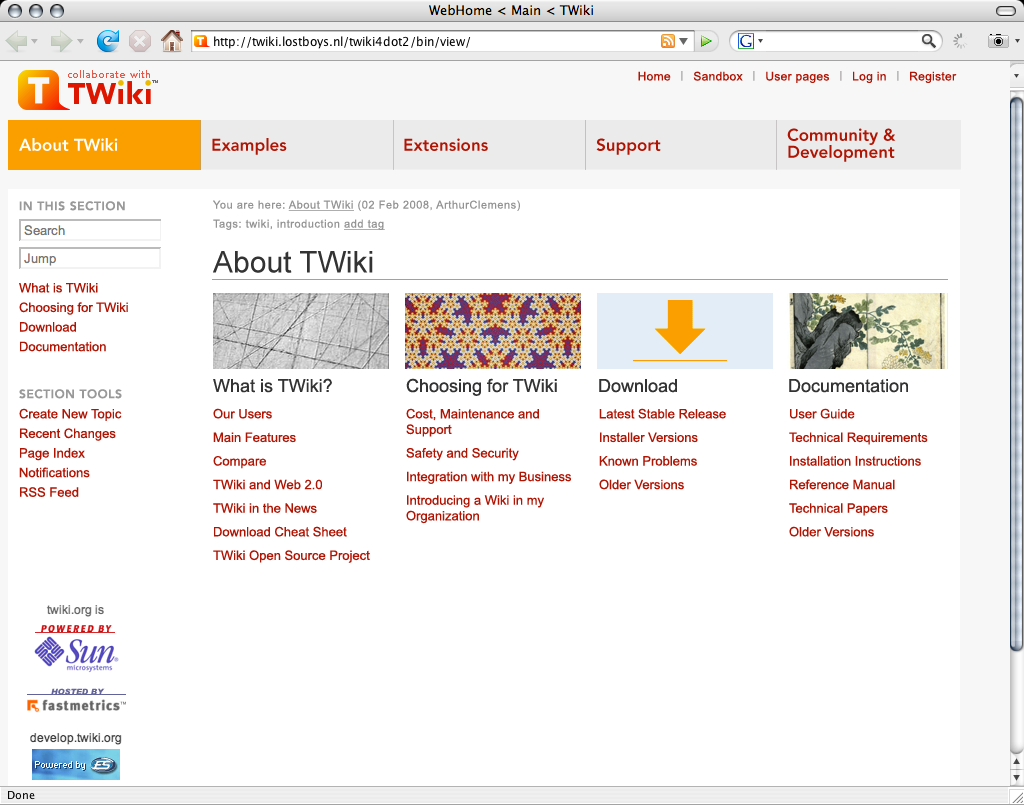
Design alternative: red menu bar, blue links: Third draft -- ArthurClemens - 03 Feb 2008 Reactions:- visual appearance
- lost a bit of "edge" by removing the red menu bar and leaving the text in red.
- problem with the sponsor links in the sidebar. Either they are too far down the sidebar and the white space above should be fixed. Or put the sponsor links in a horizontal bottom bar.
- What about the bottom of the page anyway? Are there any special links besides copyright? How about a repeated navigation?
- more contrast between the highlighted and non-highlighted sections like in draft 2. Just from the colors you can't easily tell in which section you are.
- wording
- "Choosing for TWiki" is not good English. "Why TWiki?" or "Why choose TWiki?".
- The new terminology introduced (sections) is interesting and I'm all for it ("hey, it's just namespace ..")
- renaming "About TWiki" in the tab navi with "Home" and add a "Recent blog postings" section under the "About TWiki" section on the home page?
- navigation
- have a combined search & jump box as their different purposes is not clear for new users.
- use notifications, they are very much longed for.
- Consider color coding - it is much easier to orientate your self in a color coded environment and your pages/sections appear more dynamic.
-

-

-

- More color codin examples
- Illustrator
- After Effects.
- Museum, Activities
- Service pages.
- Illustrator
-
- missing content
- A link to "Extensions" is missing in the "Download" column
- In the "What is TWiki", is "Our users" about "People using TWiki" or linking to the registered users on twiki.org?
- What about personas that want to migrate from other wiki engines to TWiki? Where do they click?
- A link to screenshots and movies somewhere would be great.
Fourth Draft
Another variation with a less distracting top bar: Fourth Draft See a test with a color coded background: Fourth Draft 2 -- ArthurClemens - 09 Feb 2008 Reactions:- red version with the blue links is better.
- Too washed out. The pages lost its balance.
Fifth Draft
How about adding a line as shown below? It makes it much clear that these serve as tabs, which one we are currently browsing and where else we may be able to go. Pankaj's Tabs -- PankajPant - 12 Feb 2008 Reactions:- Need to visually connect the body with the tab. See "Tabs or no tabs" section...
Sixth Draft
- I tweaked Pankaj idea a bit so that the buttons look more like real tabs
- sponsors at the bottom.
New Design
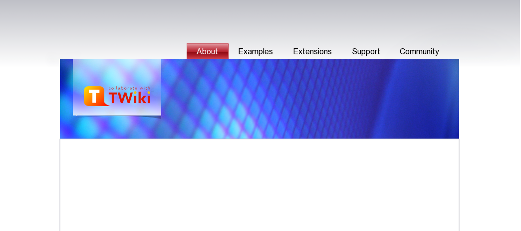
The previous design hacked too quickly. This one is more thought out. It is more a design document than a final content plan for the page "About TWiki" - some elements may be missing. Rounded design -- ArthurClemens - 19 Feb 2008Discussion
Aaaah, much better. I like the new colors. I think we could do with a little more image material to illustrate the frontpage in the header position, with secondary pages having a flat header.- Wait, this is not the front page. This is a secondary page, namely "About TWIki", or the homepage of this section. - AC
- OIC. Well, I think having header art is no must, but an "opportunity" to do something nice and meaningful. Images transport emotions immediately. It makes up a nice interior. I think we need more of that stuff on TWiki.org, even on non-frontpages. - MD
- Most header art is just decoration. I prefer to have a (more) balanced menu bar. -AC
- Hm, people like things to be nicely decorated, i.e. non-techies. - MD
- They are meant to right-align to the content (that has a fixed width), but I agree it looks like it is floating.
- I will try alignment with the content area.
- Yes, "Deploying" might be better wording. Note that all of these labels are open for change in WebPageAudienceSiteStructure.
- Correct. The 4th column is meant as example triggers that can be used on other pages as well.
- Yes, but we don't have it right now. Proposals have been put in GoIsSearch.
- That font size is only for the introduction paragraph. It makes the text look less. But there are other ways - I will have a look again.
- Good idea.
- We can't remove "Edit raw". We also can't remove an edit link at the bottom because you would need to scroll back to the top to click that universal button. And then the universal button is a part of wiki promotion.
- Because this is not the front page.
- Agreed. This is not a final page layout. And this should be done on a page by page basis if we have all the elements.
- Updated with comments MD:
- Michael's try:
 -- ArthurClemens - 21 Feb 2008
The dark bottom bar is too heave compared to the thin header art. You aren't using enough colours. I can see only two:
shades of very light gray-blue (near-by colors with very low saturation) and red (fully saturated).
Red is used too often. It is an alarm color, used to put emphasis on certain elements.
However, it is all over the page now. Red - used as an alarm color - should be used more rarely to make it work as an alarm.
How about considering a more vital color palette with colors of at least one different hue and with more saturation.
The types in the breadcrumbs
-- ArthurClemens - 21 Feb 2008
The dark bottom bar is too heave compared to the thin header art. You aren't using enough colours. I can see only two:
shades of very light gray-blue (near-by colors with very low saturation) and red (fully saturated).
Red is used too often. It is an alarm color, used to put emphasis on certain elements.
However, it is all over the page now. Red - used as an alarm color - should be used more rarely to make it work as an alarm.
How about considering a more vital color palette with colors of at least one different hue and with more saturation.
The types in the breadcrumbs
 -- MichaelDaum - 22 Feb 2008
Actually, all nice sites are quite different in layout from the L-shaped layout we have at twiki. And which is a constraint as long as we use twiki.org as a tool, not just as a communication medium. For instance a high header will become a pain. A right nav bar will not work with multiwidth text content (images, tables) - same goes for a fixed content width. But we can go one step further on the landing pages of each section.
Your design is hard to judge as long as it is this clean. Only with all the content elements you will be able to judge how useful it is. My critique with the blue image is that it takes a lot of space without attributing a meaning. But your idea for a header with a headline makes sense.
-- ArthurClemens - 22 Feb 2008
Another great resource: 10 Principles Of Effective Web Design
-- MichaelDaum - 22 Feb 2008
Actually, all nice sites are quite different in layout from the L-shaped layout we have at twiki. And which is a constraint as long as we use twiki.org as a tool, not just as a communication medium. For instance a high header will become a pain. A right nav bar will not work with multiwidth text content (images, tables) - same goes for a fixed content width. But we can go one step further on the landing pages of each section.
Your design is hard to judge as long as it is this clean. Only with all the content elements you will be able to judge how useful it is. My critique with the blue image is that it takes a lot of space without attributing a meaning. But your idea for a header with a headline makes sense.
-- ArthurClemens - 22 Feb 2008
Another great resource: 10 Principles Of Effective Web Design These are the colors I have used:
 -- ArthurClemens - 24 Feb 2008
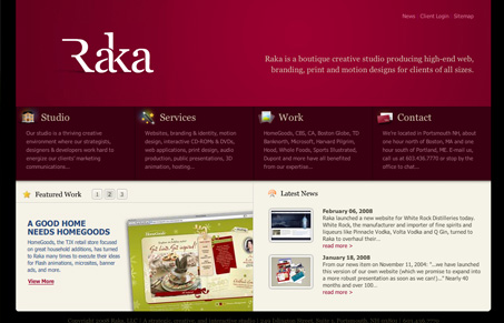
A second way to utilize the broad page setup with a showcase gallery, not unlike Michaels example of http://www.rakacreative.com
-- ArthurClemens - 24 Feb 2008
A second way to utilize the broad page setup with a showcase gallery, not unlike Michaels example of http://www.rakacreative.com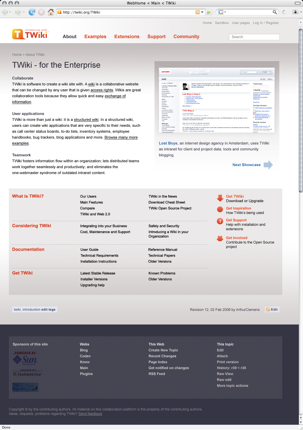 -- ArthurClemens - 24 Feb 2008
Very good progress! Arthur, you do an excellent job pushing this forward.
Here are my comments based on your most recent rounds.
There's lots of gray and gray blends.
The logos in the bottom bar shouldn't be toned down.
The header/top bar - though it has a horiz gradient - is too "untouched", i.e. its top left white corner.
The normal color of the links in the tab navi are red, while the indicator color (for the current topic) is dark-gray. How about reversing this: red attracts attention while dark-gray doesn't; attention should be generated to indicate the current location/page.
In your pallet you specified to be using a bold blue (the right most one). That's a good choice. However I cant see where it is used in your screenshot.
To make it a really balanced color map, a third color is still missing. According to your current colors (base colors = light gray + shade gray, red + light red, blue + very light blue) the third color would be in the area between yellow and green (with no specific saturation). That would be a great color for example for a h1 foreground, depending on the saturation obviously. You could also decide to use this yellow-greenish in the header art, which is missing imho
-- ArthurClemens - 24 Feb 2008
Very good progress! Arthur, you do an excellent job pushing this forward.
Here are my comments based on your most recent rounds.
There's lots of gray and gray blends.
The logos in the bottom bar shouldn't be toned down.
The header/top bar - though it has a horiz gradient - is too "untouched", i.e. its top left white corner.
The normal color of the links in the tab navi are red, while the indicator color (for the current topic) is dark-gray. How about reversing this: red attracts attention while dark-gray doesn't; attention should be generated to indicate the current location/page.
In your pallet you specified to be using a bold blue (the right most one). That's a good choice. However I cant see where it is used in your screenshot.
To make it a really balanced color map, a third color is still missing. According to your current colors (base colors = light gray + shade gray, red + light red, blue + very light blue) the third color would be in the area between yellow and green (with no specific saturation). That would be a great color for example for a h1 foreground, depending on the saturation obviously. You could also decide to use this yellow-greenish in the header art, which is missing imho  I like the design to have no side navi! This split-page (that's how I call it) works out great, giving you clearly separated sections of different
backgrounds that each focus the reader on their content, depending on how far you scrolled down. The page currently has got three sections,
not counting the header area: (1) TWiki - for Enterprise ... (2) What is TWiki?... (3) Bottom bar. So far so good. I'd add a section zero that has
got some more graphics work in it.
The universal edit button is quite hidden. Maybe it should be only visible if you are logged in, but then in a more prominent place in section 1
instead of at the bottom of section 2.
I know people using wikis don't want to scroll down passing some "punchy" graphics. They want to see their content and not some barricade
the CMS puts in between which they get bored of soon. Perfectly understandable, but not the point here.
The current work on a NewNavigationModelForTWikiDotOrg is part of marketing TWiki.org, its community and partners. It strives to
generate more attention and interest in our work, to make people stay longer on the site. It is not so much about
tempting them to click on "edit". Wiki edit usability has to step back for a while ... to come back even stronger and better later on
Therefore, let me reiterate: pictures are better in transporting emotions than anything else (even better than sound).
We need more emotions / good vibes / freshness / vitality. This is about seconds a visitor decides to stay or go away, forgetting what he has seen.
-- MichaelDaum - 25 Feb 2008
Here is another site that uses a grey-ish dark base color and one additional "feature" color that really kicks out:
http://www.ifistanbul.com/en/
-- KwangErnLiew - 26 Feb 2008
I came across this article today and thought that some of the points it makes are along the same lines as this discussion.
Web Design Best Practices: Home Page Goals
I like the design to have no side navi! This split-page (that's how I call it) works out great, giving you clearly separated sections of different
backgrounds that each focus the reader on their content, depending on how far you scrolled down. The page currently has got three sections,
not counting the header area: (1) TWiki - for Enterprise ... (2) What is TWiki?... (3) Bottom bar. So far so good. I'd add a section zero that has
got some more graphics work in it.
The universal edit button is quite hidden. Maybe it should be only visible if you are logged in, but then in a more prominent place in section 1
instead of at the bottom of section 2.
I know people using wikis don't want to scroll down passing some "punchy" graphics. They want to see their content and not some barricade
the CMS puts in between which they get bored of soon. Perfectly understandable, but not the point here.
The current work on a NewNavigationModelForTWikiDotOrg is part of marketing TWiki.org, its community and partners. It strives to
generate more attention and interest in our work, to make people stay longer on the site. It is not so much about
tempting them to click on "edit". Wiki edit usability has to step back for a while ... to come back even stronger and better later on
Therefore, let me reiterate: pictures are better in transporting emotions than anything else (even better than sound).
We need more emotions / good vibes / freshness / vitality. This is about seconds a visitor decides to stay or go away, forgetting what he has seen.
-- MichaelDaum - 25 Feb 2008
Here is another site that uses a grey-ish dark base color and one additional "feature" color that really kicks out:
http://www.ifistanbul.com/en/
-- KwangErnLiew - 26 Feb 2008
I came across this article today and thought that some of the points it makes are along the same lines as this discussion.
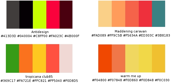
Web Design Best Practices: Home Page Goals Depends on how you guys want to portray TWiki in the end. It's by no means definitive, and you can make use of grey shades to blend in too.
Personally I find TWiki would go well with Antidesign or Maddening caravan.
-- KwangErnLiew - 29 Feb 2008
Doesn't have this discussion lost focus? It is about navigation, isn't it?
-- FranzJosefGigler - 29 Feb 2008
I wouldn't discount the use of colours when designing the layout of the website. Unless we agree to use the same default ones, but I think most would agree that it's a bit stale.
User interface/experience comes with colours too...not just navigation. If it's not true, I don't see why PatternSkin had the new facelift nor any of the above. Am just trying to play a small part in this. Like it or not, UI/UE needs to take colours into account.
-- KwangErnLiew - 29 Feb 2008
Colors play an importan role in navigation, and they can lead the user to focus on a specific part.
Even if the navigation is perfect from a cognoscitive point of view, if the wrong colors are used the effect will be lost.
Anyway, I understand Franz concern... By reading this page I still don't know which is the new navigation model for TWiki.org. I would like to see a diagram, mind map or whatever showing the different "knowledge areas", how they are related, how will the be navigated, which are the hub nodes, etc,etc...
-- RafaelAlvarez - 03 Mar 2008
The site structure is layed out in WebPageAudienceSiteStructure.
Yes, we need to reorganize these topics.
-- ArthurClemens - 03 Mar 2008
Navigation Rulez:: please have a look at this article on SmashingMagazine http://www.smashingmagazine.com/2008/02/26/navigation-menus-trends-and-examples/
Depends on how you guys want to portray TWiki in the end. It's by no means definitive, and you can make use of grey shades to blend in too.
Personally I find TWiki would go well with Antidesign or Maddening caravan.
-- KwangErnLiew - 29 Feb 2008
Doesn't have this discussion lost focus? It is about navigation, isn't it?
-- FranzJosefGigler - 29 Feb 2008
I wouldn't discount the use of colours when designing the layout of the website. Unless we agree to use the same default ones, but I think most would agree that it's a bit stale.
User interface/experience comes with colours too...not just navigation. If it's not true, I don't see why PatternSkin had the new facelift nor any of the above. Am just trying to play a small part in this. Like it or not, UI/UE needs to take colours into account.
-- KwangErnLiew - 29 Feb 2008
Colors play an importan role in navigation, and they can lead the user to focus on a specific part.
Even if the navigation is perfect from a cognoscitive point of view, if the wrong colors are used the effect will be lost.
Anyway, I understand Franz concern... By reading this page I still don't know which is the new navigation model for TWiki.org. I would like to see a diagram, mind map or whatever showing the different "knowledge areas", how they are related, how will the be navigated, which are the hub nodes, etc,etc...
-- RafaelAlvarez - 03 Mar 2008
The site structure is layed out in WebPageAudienceSiteStructure.
Yes, we need to reorganize these topics.
-- ArthurClemens - 03 Mar 2008
Navigation Rulez:: please have a look at this article on SmashingMagazine http://www.smashingmagazine.com/2008/02/26/navigation-menus-trends-and-examples/ -- ArthurClemens - 27 Jul 2008
I like this new design a lot. It gives a lot of ideas for our own TWiki. I especially like the division of "This topic" and "This web" activities and the twisty to show/hide the top actions. It demonstrates clear and simple navigation to different webs as well and, in general, seems more focused on actions and specific needs than on just being an overworked TOC.
-- DavidWolfe - 27 Jul 2008
It just dawnd on me... we're talking about a new navigation model and stuff... but what are we going to do with the current content in Codev (the stale, the crufty, and the good)?
-- RafaelAlvarez - 28 Jul 2008
Good question... See TWikiOrgRenewalWorks for past discussions.
Anyway, I'm all for starting with the new pages and add the good and needed ones one after the other. And for the rest, well just do not think about it
-- CarloSchulz - 28 Jul 2008
I like the overall approach of this design a lot. Good overview, good entry points, very clear.
The only thing that does not work for me is the left column. You have a three column layout but the left column is separated by a big border which makes the column look like too wide sidebar. The result is a page which looks somehow unbalanced.
-- CarloSchulz - 29 Jul 2008
Yes, the left bar is definitely not final. The intention is to have a site wide navigation (webs) and the topics per web side by side. So the right list can become longer.
-- ArthurClemens - 29 Jul 2008
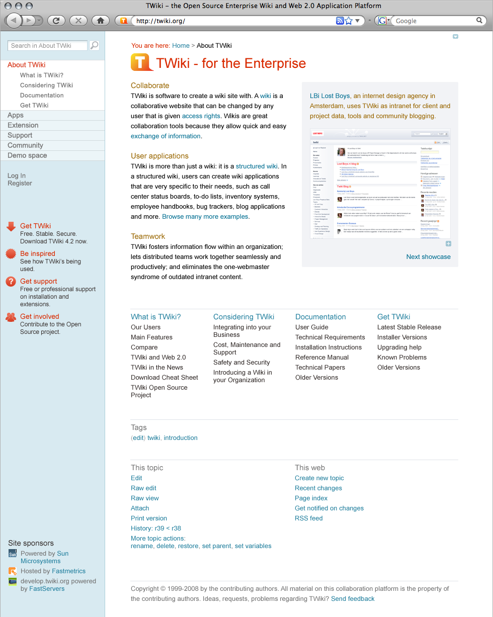
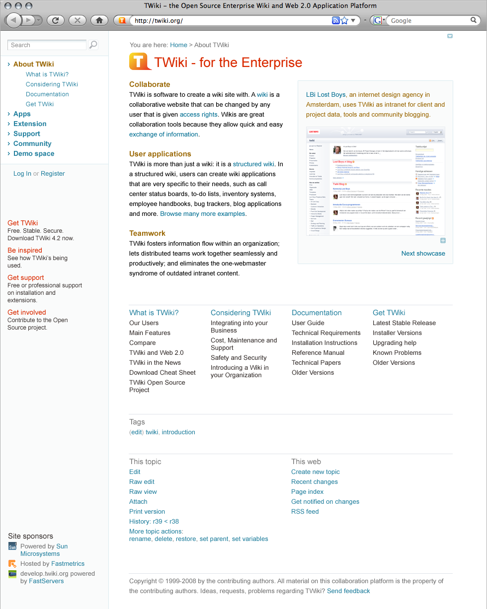
I have created a more traditional left bar. Of course the number of listed topics in each web needs to be limited (which is not a bad thing).
vertical11.png
-- ArthurClemens - 30 Jul 2008
Great work Arthur! Very good compared to the previous ones. Will this be the standard throughout the site? If that's the case, it'd be good to see some layouts for view and edit mode.
My main concern is the
-- ArthurClemens - 27 Jul 2008
I like this new design a lot. It gives a lot of ideas for our own TWiki. I especially like the division of "This topic" and "This web" activities and the twisty to show/hide the top actions. It demonstrates clear and simple navigation to different webs as well and, in general, seems more focused on actions and specific needs than on just being an overworked TOC.
-- DavidWolfe - 27 Jul 2008
It just dawnd on me... we're talking about a new navigation model and stuff... but what are we going to do with the current content in Codev (the stale, the crufty, and the good)?
-- RafaelAlvarez - 28 Jul 2008
Good question... See TWikiOrgRenewalWorks for past discussions.
Anyway, I'm all for starting with the new pages and add the good and needed ones one after the other. And for the rest, well just do not think about it
-- CarloSchulz - 28 Jul 2008
I like the overall approach of this design a lot. Good overview, good entry points, very clear.
The only thing that does not work for me is the left column. You have a three column layout but the left column is separated by a big border which makes the column look like too wide sidebar. The result is a page which looks somehow unbalanced.
-- CarloSchulz - 29 Jul 2008
Yes, the left bar is definitely not final. The intention is to have a site wide navigation (webs) and the topics per web side by side. So the right list can become longer.
-- ArthurClemens - 29 Jul 2008
I have created a more traditional left bar. Of course the number of listed topics in each web needs to be limited (which is not a bad thing).
vertical11.png
-- ArthurClemens - 30 Jul 2008
Great work Arthur! Very good compared to the previous ones. Will this be the standard throughout the site? If that's the case, it'd be good to see some layouts for view and edit mode.
My main concern is the This topic and This web where it's all the way underneath. Not sure what it is, but it's just a bother to me.
Also, what's the function of the top right arrow?
-- KwangErnLiew - 31 Jul 2008
I like this layout also. For the bottom links, it may be less intrusive if we ordered them horizontally, like at the bottom of linkedin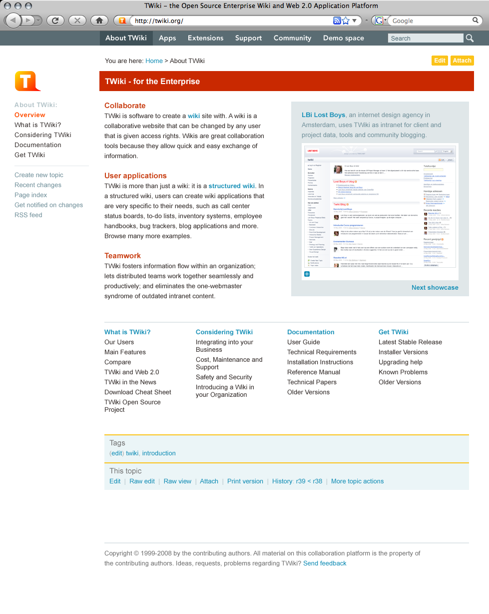 -- ArthurClemens - 03 Aug 2008
While I agree with Michael that a bit more graphics are called for (something like the current header with the graphic, search and jump boxes) and maybe some elements need to be shifted or gain more emphasis, I actually like the navigation and general layout of the previous revision better. Here's why:
Navigation in the previous revision is all in one place. In the new version, it's divided between top and left. I think this is confusing and harder to follow. The navigation all in the left bar as before may not follow the top-tabbed navigation model of most of the WWW, but it is clear, simple, and easy-to-use. Splitting it between top and left just doesn't seem to make any sense to me.
Actions are treated the same way in this new layout. They are divided between left (web) and bottom (topic) actions. This is exactly what we have now. I think that people find these divisions of like information/navigation to be confusion and unintuitive. Like items should always be presented together.
As for spacing between elements, spacing should be "unbalanced." That is, items that belong together should be separated by some space. Items or groups of items that are separate should be separated by more space. This is part of the problem with the current styles and layout of TWiki. The space between heading levels is the same or almost the same. Font sizes of head levels is the same or almost the same. Head levels 1–3 are not bold. Head levels 4–6 are bold, which is just backward. All heads are the same color, and many share the same graphic treatment (gray bar or horizontal line).
On the left bar: in the current TWiki, there is very many information/navigation elements that are quite convenient for TWiki developers and admins, but are of little day-to-day use for most users. These items take up valuable space in the left bar and discourage users from customizing their own left bar because the more they add, the longer the left bar gets, pushing items further and further down the page and making them less accessible. As most user interaction with TWiki likely involves topic and web navigation rather than action, maybe the left bar should be dedicated to navigation entirely and leave off navigation items that are admin-oriented or infrequently used (Statistics, preferences, webnotify, for example). We admins and developers can always add the action items we use most often to our personal left bar.
While color can make communication more visually appealing (you want to look at it), if that color serves no purpose in the organization of information, the communication is actually less effective (it's difficult to understand).
In my reading of all of this topic and all the other topics leading its creation, it is clear to me that the goal of this redesign is not to simply "spruce up" TWiki. The goal is to simplify navigation, presentation, and organization of key content. That might mean that some things that we are all accustomed to seeing might be moved, de-emphasized or even eliminated. Just because something has been in a given position for the past five years doesn't mean that that's the best position for that element.
-- DavidWolfe - 03 Aug 2008
I like this layout a lot.
-- MartinSeibert - 20 Oct 2008
I also like the 03 Aug 2008 - for TWiki.org.
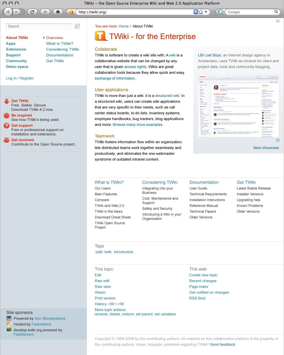
I would not want the default skin shipped with TWiki like this because the number of webs many of us have cannot fit in a top bar horizontally.
But for TWiki.org the top bar fits well.
Only the TWiki web is not there but placed as Documentation link in left bar. I think this will fly well.
What we see is the front page.
For the general pages some things are missing for daily use. A link to the Main (Users) web, and the info of date/time/rev/Wikiname of the topic is so important for daily use. And it has to be at the top so you can decide to not read a topic without scrolling and without hovering the mouse on top of something. It can be grey and small types to be very little dominating but should be visible.
But we have the important principles kept. Edit at the top. Attach could be at the bottom only. It is rarely used and I would not mind scrolling to attach. I'd rather have a Raw Edit button at the top.
Bottom bar is good. I have the history part I need so I can see what changed. I do not need 5 revisions visible. If we installed the CompareRevisionsPlugin/HIstoryPlugin it will be even better. Backlinks is gone which is fine. It is available in More Topic Actions.
Yeah, I like it.
-- KennethLavrsen - 21 Oct 2008
This is already outdated, AFAIK, superseeded by TWikiOrgSkin.
-- MichaelDaum - 23 Oct 2008
-- ArthurClemens - 03 Aug 2008
While I agree with Michael that a bit more graphics are called for (something like the current header with the graphic, search and jump boxes) and maybe some elements need to be shifted or gain more emphasis, I actually like the navigation and general layout of the previous revision better. Here's why:
Navigation in the previous revision is all in one place. In the new version, it's divided between top and left. I think this is confusing and harder to follow. The navigation all in the left bar as before may not follow the top-tabbed navigation model of most of the WWW, but it is clear, simple, and easy-to-use. Splitting it between top and left just doesn't seem to make any sense to me.
Actions are treated the same way in this new layout. They are divided between left (web) and bottom (topic) actions. This is exactly what we have now. I think that people find these divisions of like information/navigation to be confusion and unintuitive. Like items should always be presented together.
As for spacing between elements, spacing should be "unbalanced." That is, items that belong together should be separated by some space. Items or groups of items that are separate should be separated by more space. This is part of the problem with the current styles and layout of TWiki. The space between heading levels is the same or almost the same. Font sizes of head levels is the same or almost the same. Head levels 1–3 are not bold. Head levels 4–6 are bold, which is just backward. All heads are the same color, and many share the same graphic treatment (gray bar or horizontal line).
On the left bar: in the current TWiki, there is very many information/navigation elements that are quite convenient for TWiki developers and admins, but are of little day-to-day use for most users. These items take up valuable space in the left bar and discourage users from customizing their own left bar because the more they add, the longer the left bar gets, pushing items further and further down the page and making them less accessible. As most user interaction with TWiki likely involves topic and web navigation rather than action, maybe the left bar should be dedicated to navigation entirely and leave off navigation items that are admin-oriented or infrequently used (Statistics, preferences, webnotify, for example). We admins and developers can always add the action items we use most often to our personal left bar.
While color can make communication more visually appealing (you want to look at it), if that color serves no purpose in the organization of information, the communication is actually less effective (it's difficult to understand).
In my reading of all of this topic and all the other topics leading its creation, it is clear to me that the goal of this redesign is not to simply "spruce up" TWiki. The goal is to simplify navigation, presentation, and organization of key content. That might mean that some things that we are all accustomed to seeing might be moved, de-emphasized or even eliminated. Just because something has been in a given position for the past five years doesn't mean that that's the best position for that element.
-- DavidWolfe - 03 Aug 2008
I like this layout a lot.
-- MartinSeibert - 20 Oct 2008
I also like the 03 Aug 2008 - for TWiki.org.
I would not want the default skin shipped with TWiki like this because the number of webs many of us have cannot fit in a top bar horizontally.
But for TWiki.org the top bar fits well.
Only the TWiki web is not there but placed as Documentation link in left bar. I think this will fly well.
What we see is the front page.
For the general pages some things are missing for daily use. A link to the Main (Users) web, and the info of date/time/rev/Wikiname of the topic is so important for daily use. And it has to be at the top so you can decide to not read a topic without scrolling and without hovering the mouse on top of something. It can be grey and small types to be very little dominating but should be visible.
But we have the important principles kept. Edit at the top. Attach could be at the bottom only. It is rarely used and I would not mind scrolling to attach. I'd rather have a Raw Edit button at the top.
Bottom bar is good. I have the history part I need so I can see what changed. I do not need 5 revisions visible. If we installed the CompareRevisionsPlugin/HIstoryPlugin it will be even better. Backlinks is gone which is fine. It is available in More Topic Actions.
Yeah, I like it.
-- KennethLavrsen - 21 Oct 2008
This is already outdated, AFAIK, superseeded by TWikiOrgSkin.
-- MichaelDaum - 23 Oct 2008


| I | Attachment | History | Action | Size | Date | Who | Comment |
|---|---|---|---|---|---|---|---|
| |
Amazon-like_tabs_1.png | r1 | manage | 252.5 K | 2008-02-12 - 19:47 | UnknownUser | Amazon-like tabs, sponsors at the bottom |
| |
Amazon-like_tabs_2.png | r1 | manage | 252.6 K | 2008-02-12 - 19:48 | UnknownUser | Amazon-like tabs, sponsors at the bottom |
| |
Design_TWikiDotOrg13b.png | r1 | manage | 196.6 K | 2008-02-09 - 01:48 | UnknownUser | Gray bar |
| |
Design_TWikiDotOrg13c.png | r1 | manage | 197.7 K | 2008-02-09 - 01:59 | UnknownUser | Color coded background |
| |
Design_TWikiDotOrg4c.png | r1 | manage | 197.2 K | 2008-02-03 - 01:18 | UnknownUser | Design proposal |
| |
Design_TWikiDotOrg6.png | r3 r2 r1 | manage | 195.7 K | 2008-02-03 - 12:41 | UnknownUser | Less red |
| |
Design_TWikiDotOrg7.png | r2 r1 | manage | 197.0 K | 2008-02-04 - 07:57 | UnknownUser | Red bar, blue links |
| |
Design_TWikiDotOrg_CS.png | r1 | manage | 236.8 K | 2008-02-12 - 11:49 | UnknownUser | red & blue topbar |
| |
IrvingtonSnap5.png | r1 | manage | 70.0 K | 2007-10-23 - 14:14 | UnknownUser | |
| |
NavBar.png | r1 | manage | 13.7 K | 2008-02-12 - 14:32 | UnknownUser | Navigation bar mockup |
| |
NewNavModell.png | r1 | manage | 269.4 K | 2007-10-15 - 18:35 | UnknownUser | |
| |
TWikiPage1.png | r1 | manage | 199.9 K | 2008-02-21 - 14:21 | UnknownUser | Michael's try |
| |
breadcrumbssnap1.png | r1 | manage | 2.4 K | 2008-02-22 - 08:52 | UnknownUser | |
| |
broad5.png | r3 r2 r1 | manage | 172.6 K | 2008-02-24 - 00:05 | UnknownUser | Broad layout, no left bar |
| |
broad5_colors.png | r1 | manage | 8.0 K | 2008-02-23 - 22:07 | UnknownUser | Color palette |
| |
broad6.png | r2 r1 | manage | 732.1 K | 2008-02-24 - 22:14 | UnknownUser | Includes showcase block |
| |
color_coding_1.png | r1 | manage | 14.2 K | 2008-02-08 - 11:11 | UnknownUser | |
| |
color_coding_2.png | r1 | manage | 18.6 K | 2008-02-08 - 11:13 | UnknownUser | |
| |
color_coding_3.png | r1 | manage | 20.7 K | 2008-02-08 - 11:14 | UnknownUser | |
| |
colours.jpg | r1 | manage | 36.6 K | 2008-02-29 - 15:51 | UnknownUser | |
| |
palette.png | r1 | manage | 3.1 K | 2008-07-27 - 10:59 | UnknownUser | Color palette |
| |
raka.jpg | r1 | manage | 46.8 K | 2008-02-22 - 10:57 | UnknownUser | http://www.rakacreative.com |
| |
rounded16.png | r1 | manage | 123.2 K | 2008-02-19 - 20:56 | UnknownUser | New design |
| |
rounded17.png | r1 | manage | 150.2 K | 2008-02-20 - 23:56 | UnknownUser | Updated with comments MD |
| |
rounded20.png | r1 | manage | 211.4 K | 2008-02-21 - 20:41 | UnknownUser | Cleaner, and with picture |
| |
vertical10.png | r3 r2 r1 | manage | 231.4 K | 2008-07-30 - 09:58 | UnknownUser | Smaller left bar |
| |
vertical11.png | r1 | manage | 227.2 K | 2008-07-30 - 21:34 | UnknownUser | |
| |
vertical14.png | r2 r1 | manage | 207.9 K | 2008-08-03 - 12:09 | UnknownUser | |
| |
vertical8.png | r2 r1 | manage | 229.4 K | 2008-07-27 - 00:36 | UnknownUser | Cleaner design, wide left bar |
| |
vertical8_edit_pane.png | r4 r3 r2 r1 | manage | 233.6 K | 2008-07-27 - 11:18 | UnknownUser | Cleaner design, wide left bar, edit mode |
| |
vertical9.png | r2 r1 | manage | 225.4 K | 2008-07-27 - 14:19 | UnknownUser | |
| |
vertical9_edit_pane.png | r3 r2 r1 | manage | 233.0 K | 2008-07-27 - 14:25 | UnknownUser |
Topic revision: r100 - 2008-10-23 - MichaelDaum


Copyright © 1999-2026 by the contributing authors. All material on this collaboration platform is the property of the contributing authors.