Feature Proposal: New Layout for More Screen
Motivation
The current More screen has grown over time and had become more and more cluttered. While there is sense in having all options accessible within the one screen, it seldom occurs you are doing more than one action at a time (succesful actions will lead you back to the view page). So easy access does not provide fast manipulation. I want to propose a layout based on showing the possible options in a clean way. It is currently closer to a brainstorm than a final design.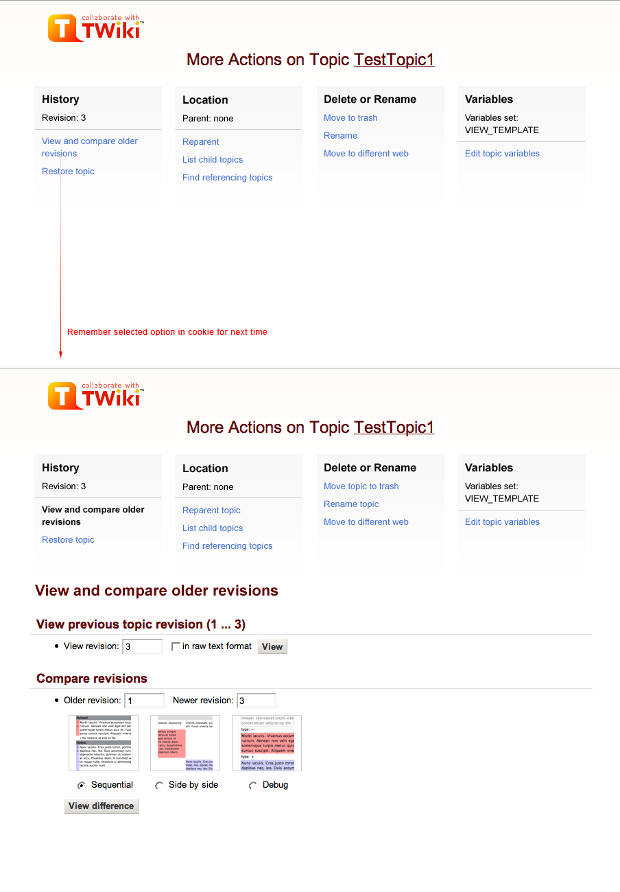 -- Contributors: ArthurClemens - 19 May 2008
Discussion


Topic revision: r2 - 2008-05-20 - ArthurClemens


Copyright © 1999-2026 by the contributing authors. All material on this collaboration platform is the property of the contributing authors.